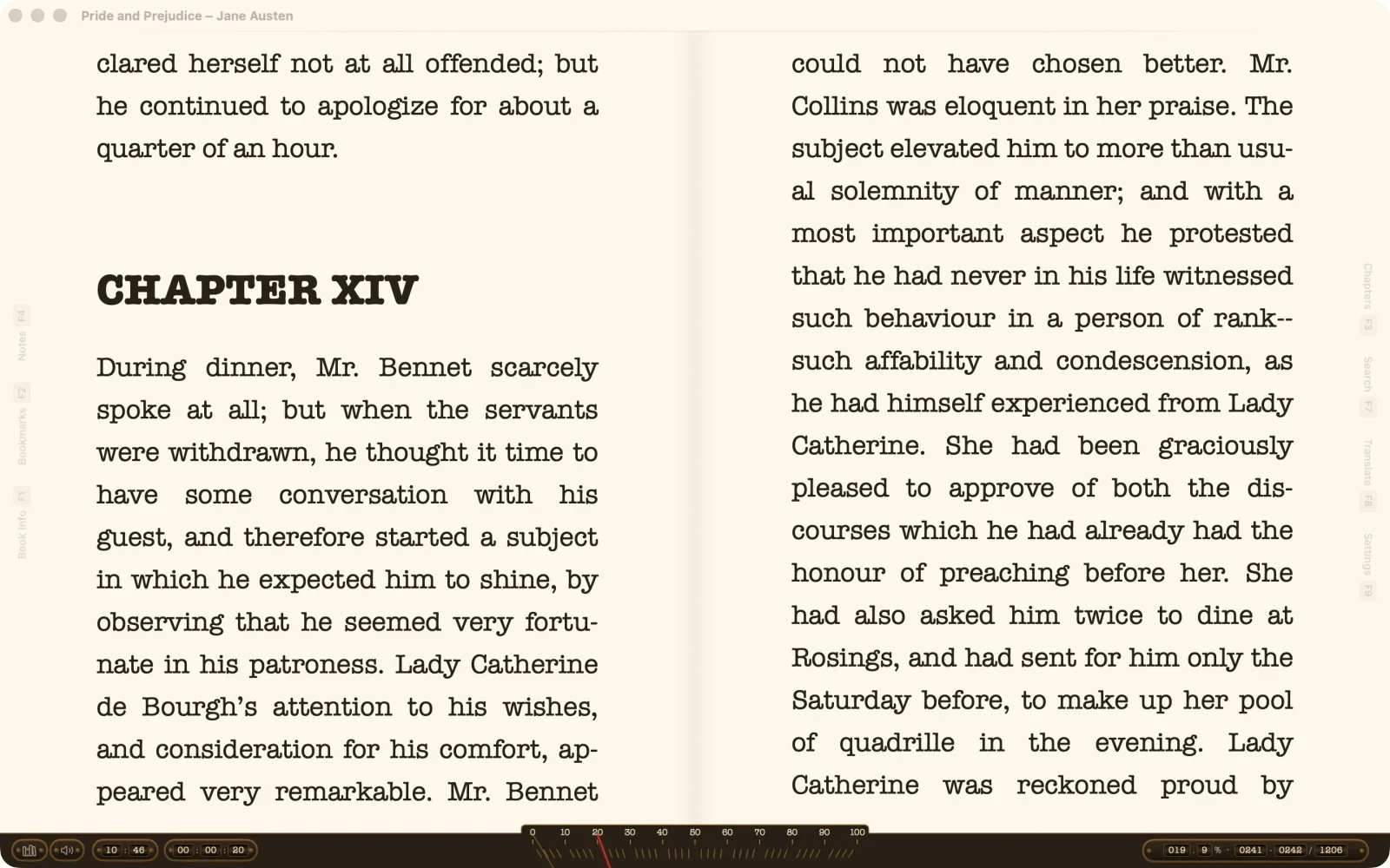
September 12, 2026. The release where the reader became yours to arrange: panels that go where you put them, more in the library, and reading on the iPhone’s small screen given attention of its own. Here is what changed, with pictures. The itemised list is in the changelog.
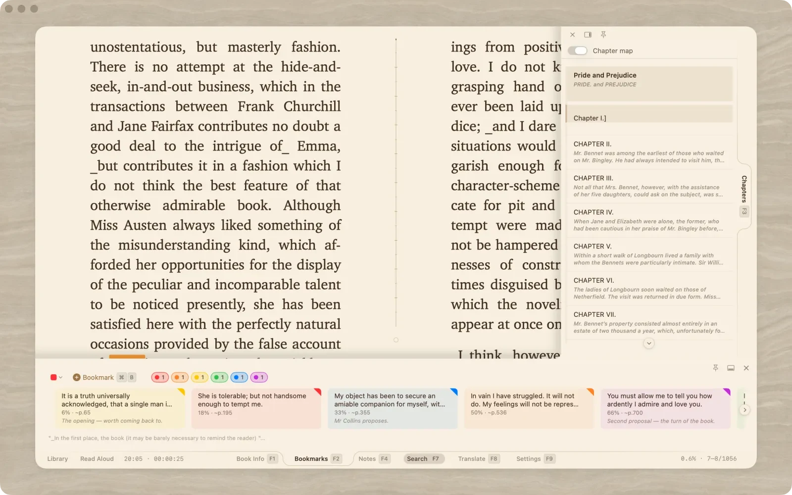
Bookmarks, notes, chapters, search, pictures and translation used to live in one side panel. In 1.5 each is a panel of its own. Dock it to any edge of the reader, let it float as a window, pin it so it stays, or hide it until you press its key. Notes on the left, bookmarks on the right, navigation along the top — whatever your reading needs today. Something like an IDE for reading.
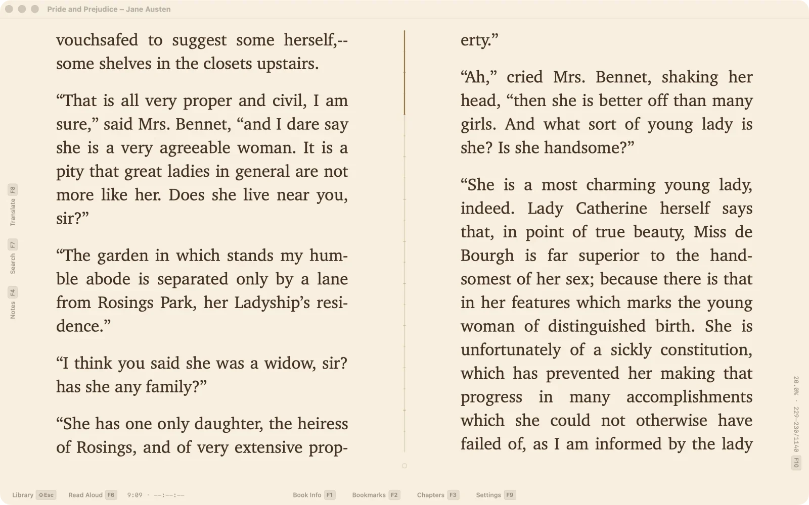
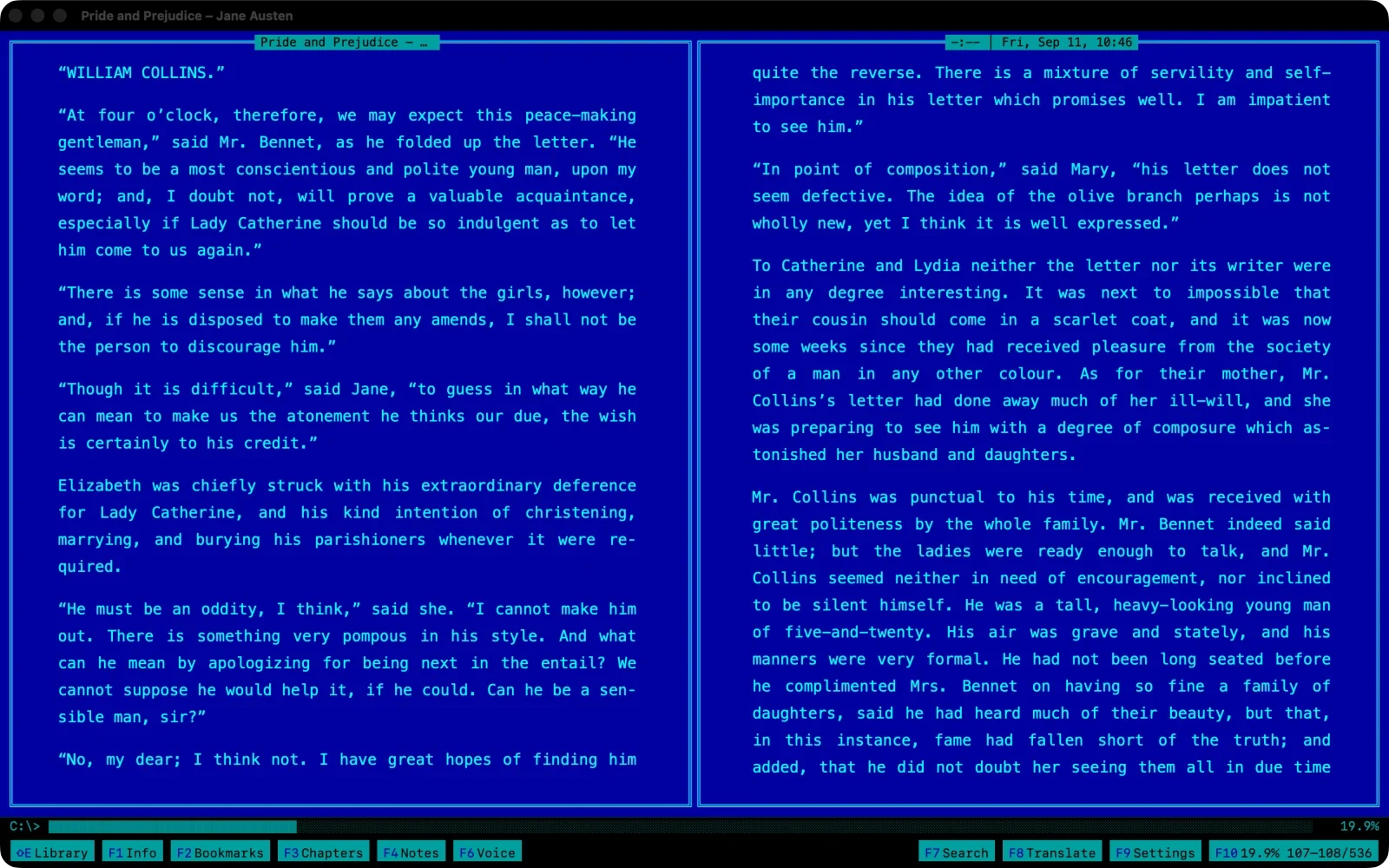
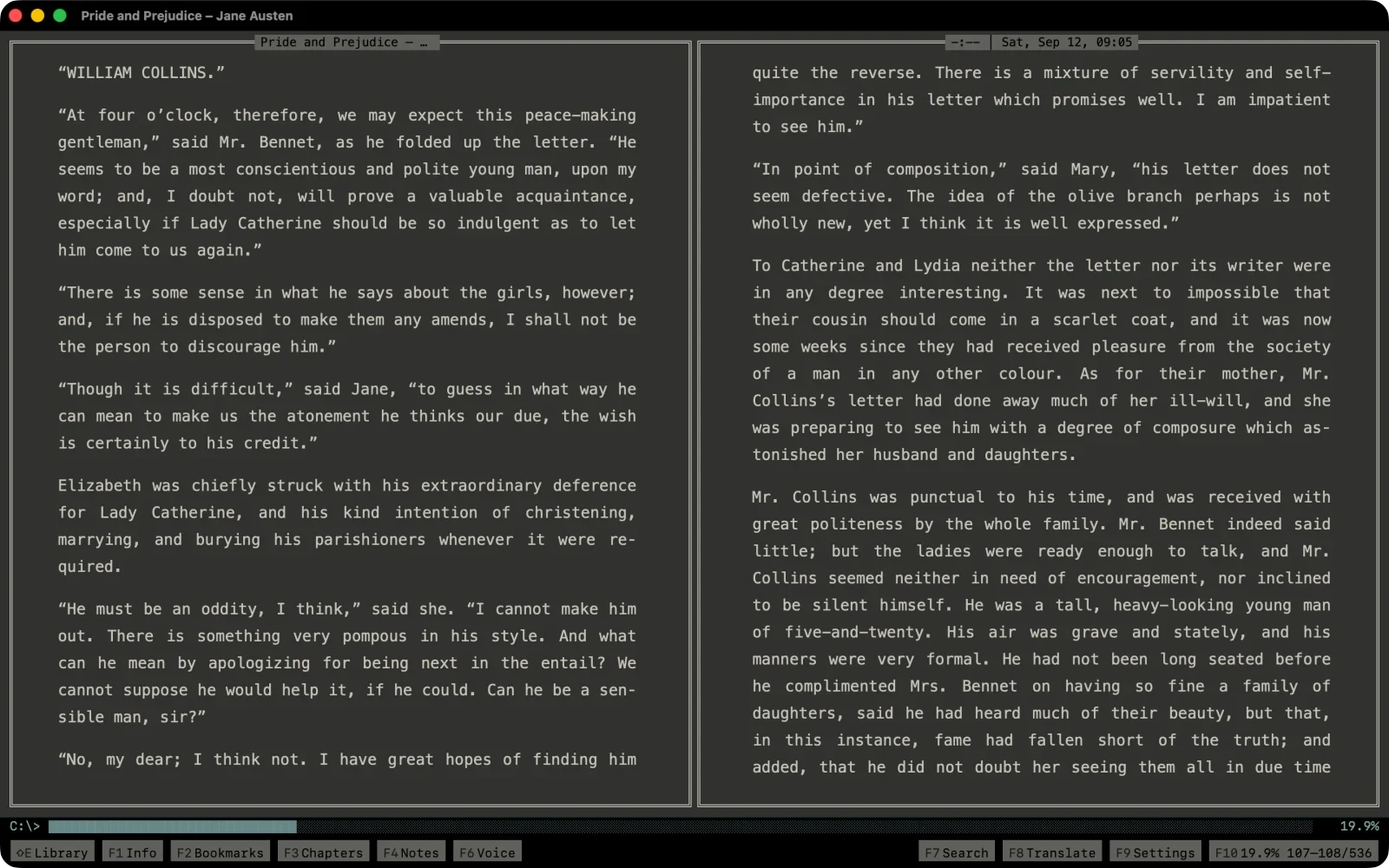
The docks understand the themes. Typewriter keeps its brass bar and its counters; Terminal keeps its frame. On the iPad the same panels dock the same way; the iPhone gets its own answer, below.
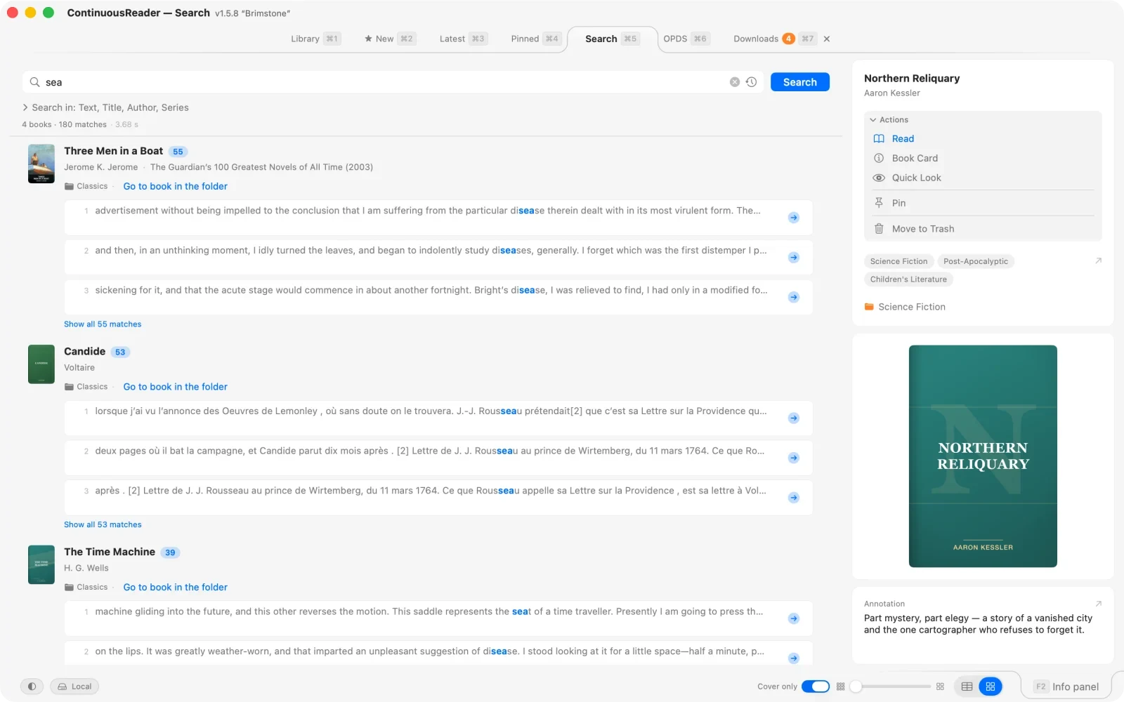
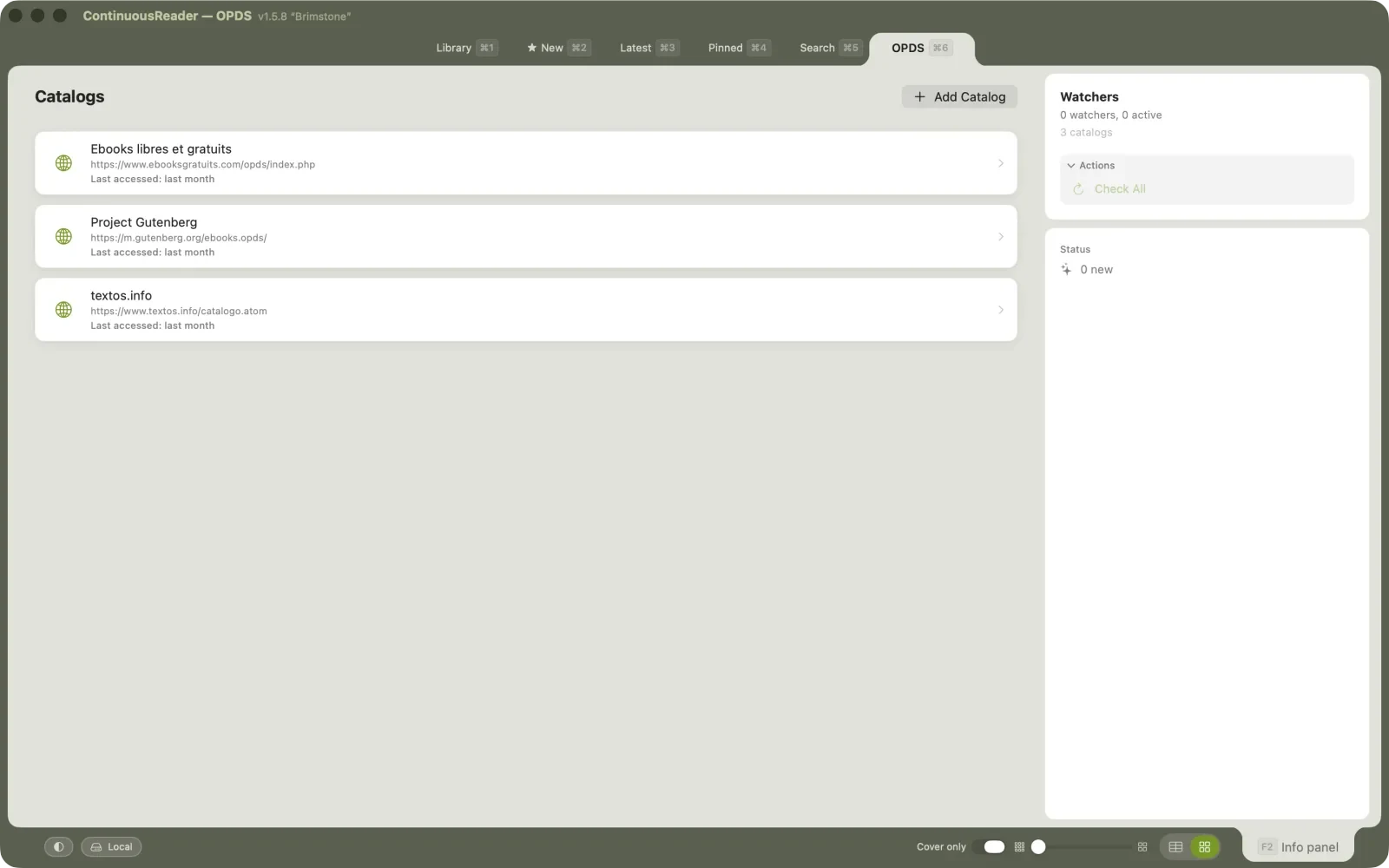
Search is a tab now. Type once and search the whole library, or start from a folder and search only what is in it — the hit list opens the book, or jumps straight to the place in the text. OPDS catalogs and watchers moved into tabs too, with filters that reach into the books themselves.
New in the same row: the Downloads tab. Paste a list of links — from a forum, a mailing, a catalog page — and the basket fetches them one after another, retries after a dropped connection, and files every book where you said. Folders show everything inside their subfolders as one list, the Trash remembers where a book came from, and folders and genres have management windows of their own.
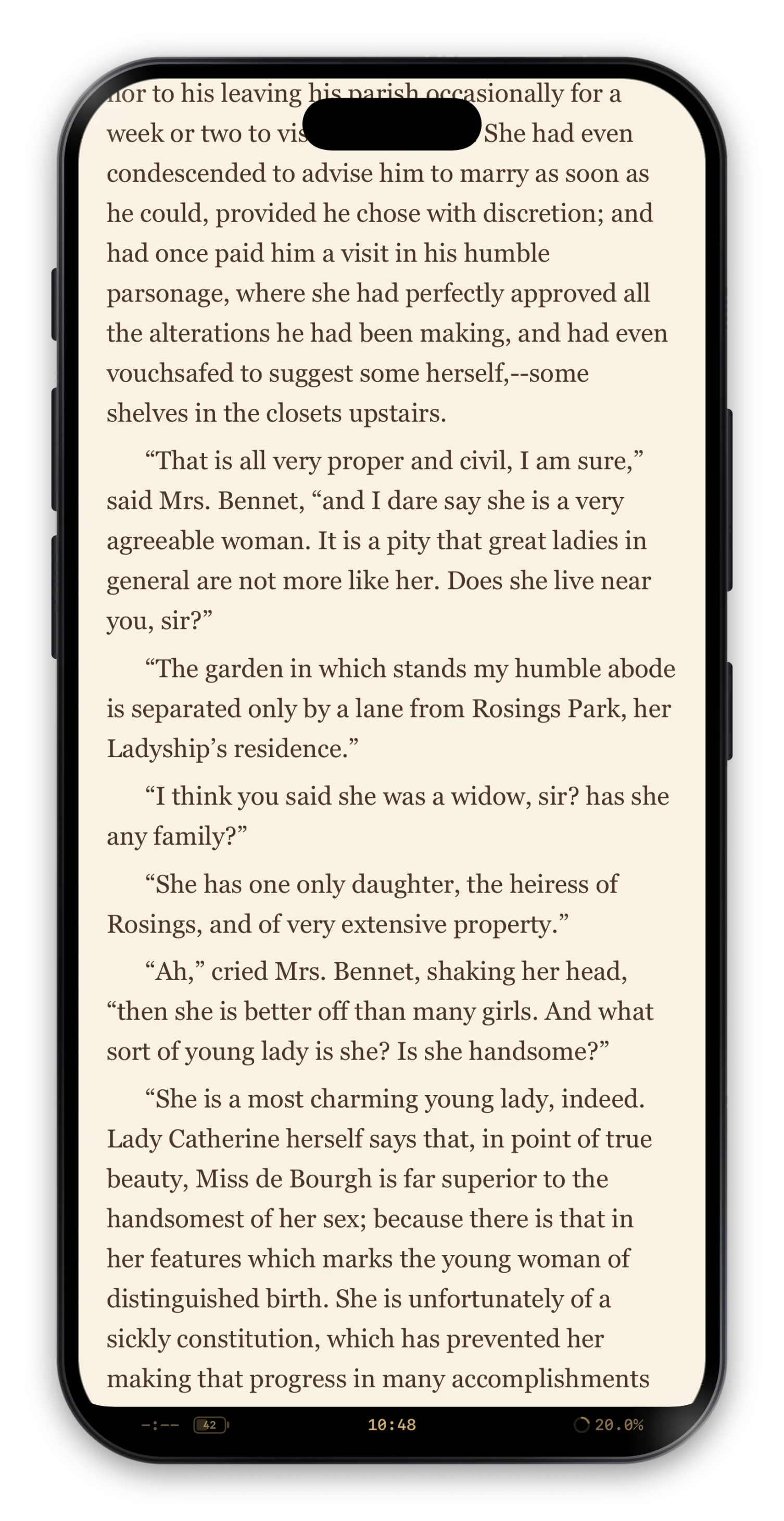
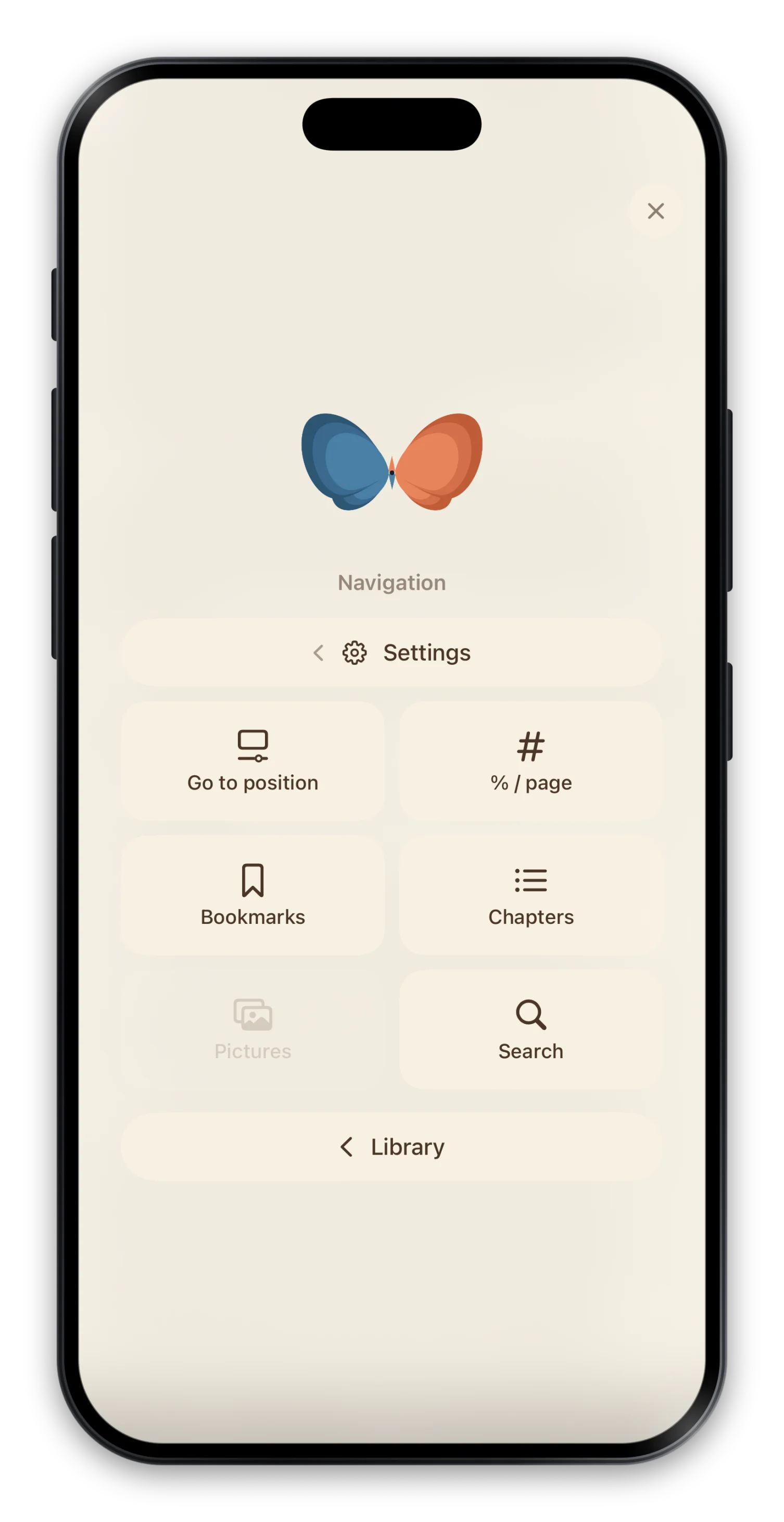
Reading on the iPhone is full-screen: the text takes the whole display, the clock and the progress sit where you choose. The corners are alive — settings at one, navigation at the other, as tiles that open under your thumb — and the centre of the page is no longer a tap zone, so nothing happens by accident where you hold the phone.
Selection has its own mode along the top edge, the chapters open as a full-screen sheet, and a book’s card fills the screen with tabs you swipe through.
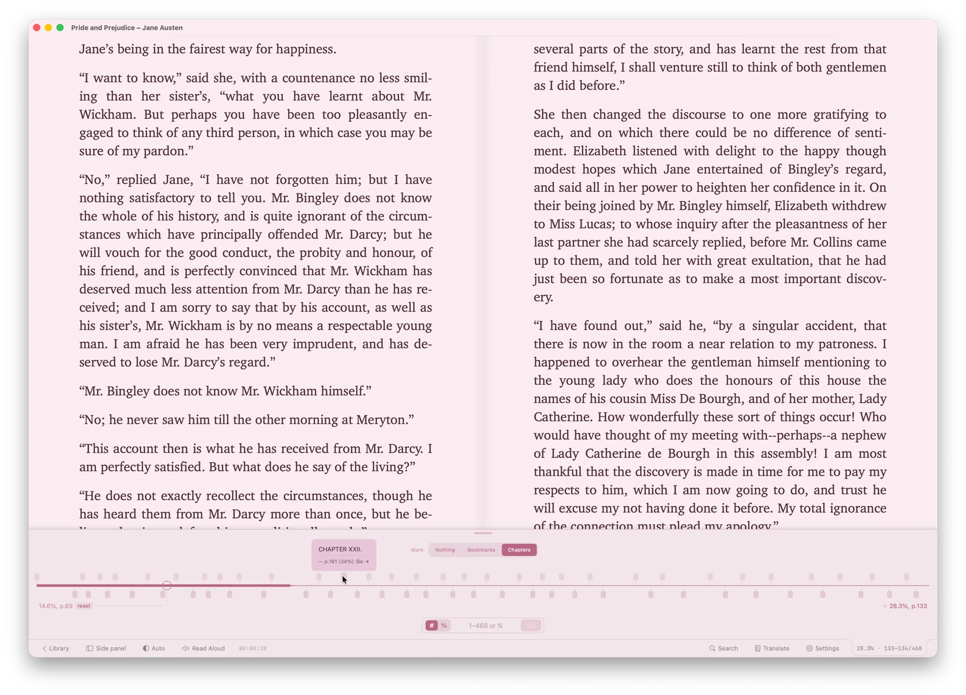
The progress readout is yours to choose: a full line, just the percent, a segmented bar, or a round dial. In a two-page spread the reading line can stand in the gutter itself, between the pages, and fill as you read. Before you jump — from the progress bar, from a chapter, from a bookmark — a lens shows the text at the destination, so you never miss.
Chapters come as a filmstrip, the pictures of the book as a gallery panel, and search results as a numbered list with every hit marked on the page.
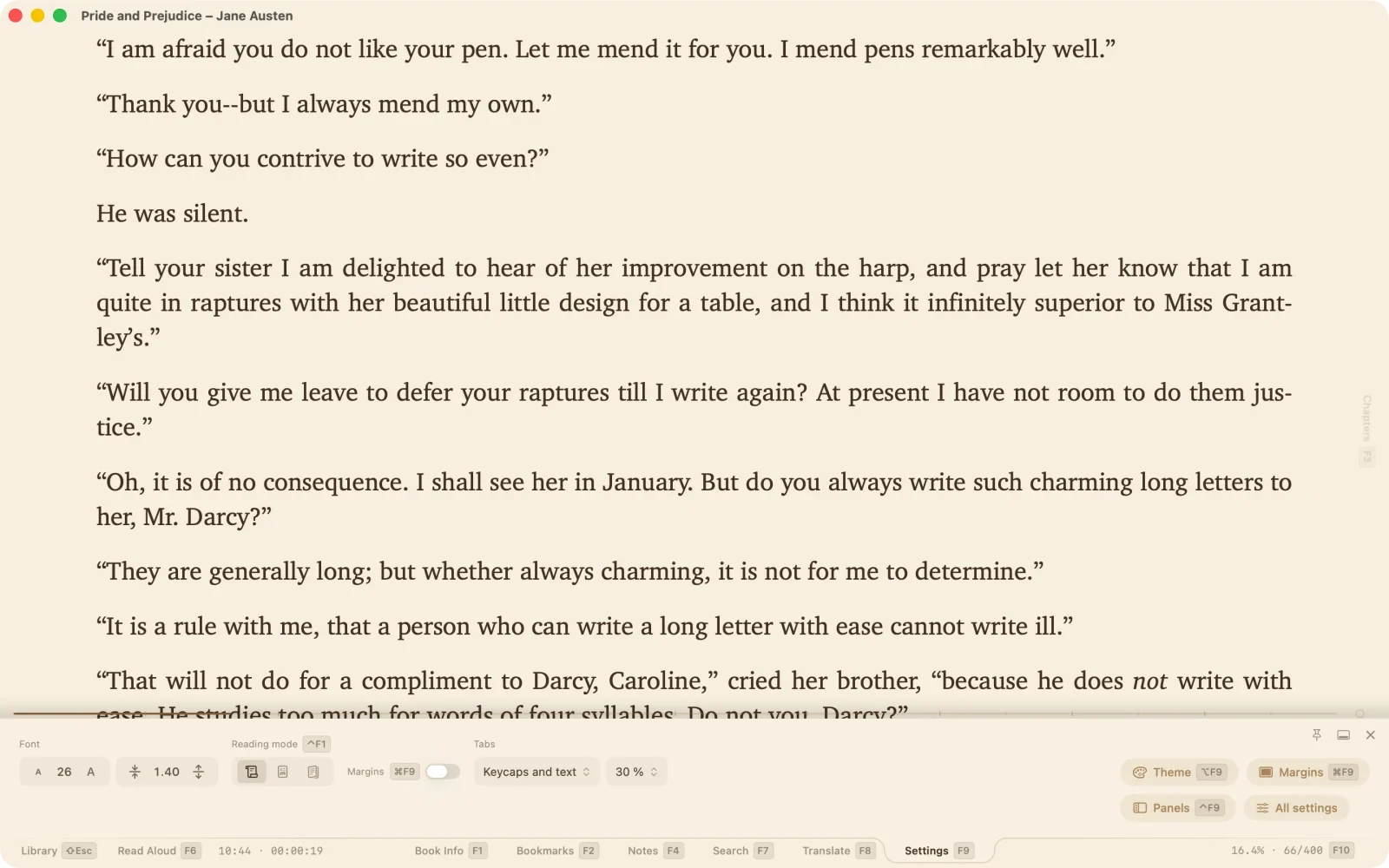
Terminal and Typewriter have night versions. Covers can take the reading theme’s colours, so the shelf matches the page. Quick settings open as a panel with named sections — font, reading mode, tabs, and the doors to the theme, margins and panel settings — instead of a strip of icons.
The desk under a page with margins is tinted in the theme’s colour, and the two-page spread keeps its gutter light under any theme.
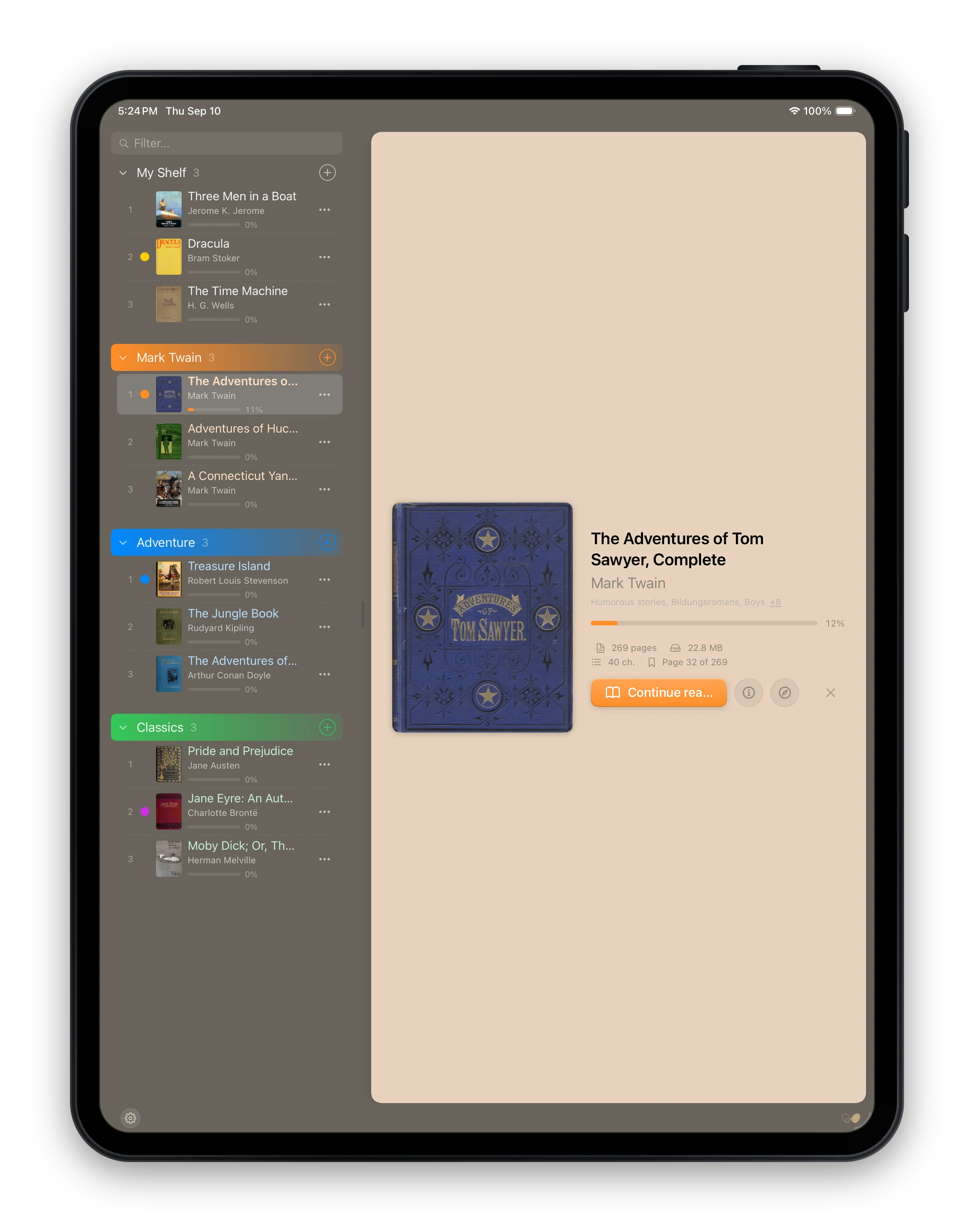
PlainReader’s shelf got dividers: named, coloured, foldable categories, beside the book or as the home page, with a filter over the whole shelf, multi-file import, selection, and the whole shelf reachable from the keyboard. Still not a library — just books in a stack, though the stack can be tall now: up to 999 books.
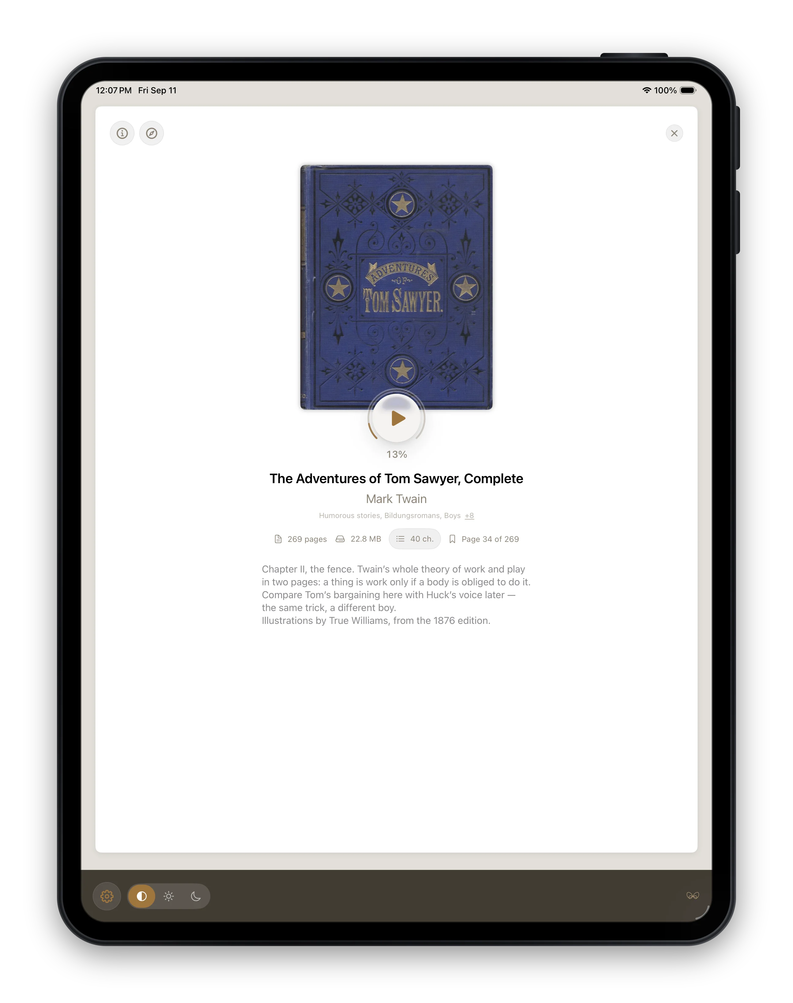
JustReader’s cover now opens the book’s doors: chapters and bookmarks are one tap away from the home page, and the notes panel carries the card’s own editor. Underneath, all three apps read with the same engine, so every reader change above is theirs too.
That is the picture. The full list, item by item, is in the changelog.